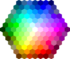
Color:
Color is extremely important in every aspect, especially on deciding what color is going to be my magazine. Color influences the audience. A way that makes any magazine page outstanding is the colors that are used. The colors can reflect on the mood of the reader. Color adds meaning to a page instead of having a plain white page.

Selecting the wrong color can cause disengagement of reader's. There are three primary colors which are: blue, red, and yellow.
Warm colors: Orange, Red, Yellow. These colors evoke energy and passion.
Neutral Colors: Black, Brown, White. Used very often as background colors. White and Black are one of the most used colors in magazines, they match and go along with any layout or color. And then brown gives out a very funky feeling.
The masthead of my fitness magazine is going to be Red. I'm choosing red because it's a very vibrant color, it could be seen from far away and also catches the attention of the reader from the rest of the colors. Red is also a vey popular color among fitness magazines.
Here is an example of a masthead in Red

According to the institute of Color Research, people make judgement on your content "in 90 seconds or less", and the majority of the judgement is based out of color. My magazine is going to have a more sense of different coloring, due to the background being the gym. I'm going to use white as the color of my content in the front cover and then black inside the content of the magazine, paragraphs, articles etc. I'm going to use many different other bright colors because color is important and using different colors is more amusing than being plain. The audience's eyes are more likely to catch the eye of rainbow colors than just plain dark gloomy colors.

https://www.flip180media.com/tips-for-periodical-publishers/color-theory-designing-your-digital-publication/


No comments:
Post a Comment