Rough Draft:
I'm currently working on my Front Cover Fitness Magazine. It is a rough draft and I will continue to work on it.
Rough Draft:
I'm currently working on my Front Cover Fitness Magazine. It is a rough draft and I will continue to work on it.
Timeline:
February 16 4:55pm
I scouted areas in my gym for possible magazine cover shots.
February 24
My teacher told the class that we need to start taking pictures or film, for our projects. As soon as she told us, I started to think of who I could possibly take photos of and my friend came into mind. So I texted my friend Nick, who is the closest friend of mine who matches the description of the type of person I want for my Fitness Magazine.
February 27 1:00pm
My friend Nick and I met at the local gym and I took multiple shots of him.
Photoshoot:
I went to the gym and took multiple pictures for my magazine. I'm testing out the angles and analyzing the best possible pictures to include in my content and front cover. I asked a close friend of mine if he could be in my magazine and he said yes. He's a young male and athletic. I chose him because he matches the description of the type of person I want to be in my magazine.
Lighting:
Lighting is the most important component of any picture. Without light you won't even be able to see the image. The two main types of lighting are natural and artificial lighting. My magazine is going to consist mainly of natural lighting. The location of my my magazine is going to be the gym and in my gym there is a lot of windows, which sunlight comes through and ignites the place. And I'm taking the shots in the daytime in order to take full advantage of this lighting because I believe that natural lighting is the best type of lighting. Of course my magazine is not just going to contain natural lighting but also some artificial lighting.
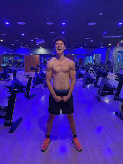
Here's an example of one of the artificial lighting shots that I took for my magazine:

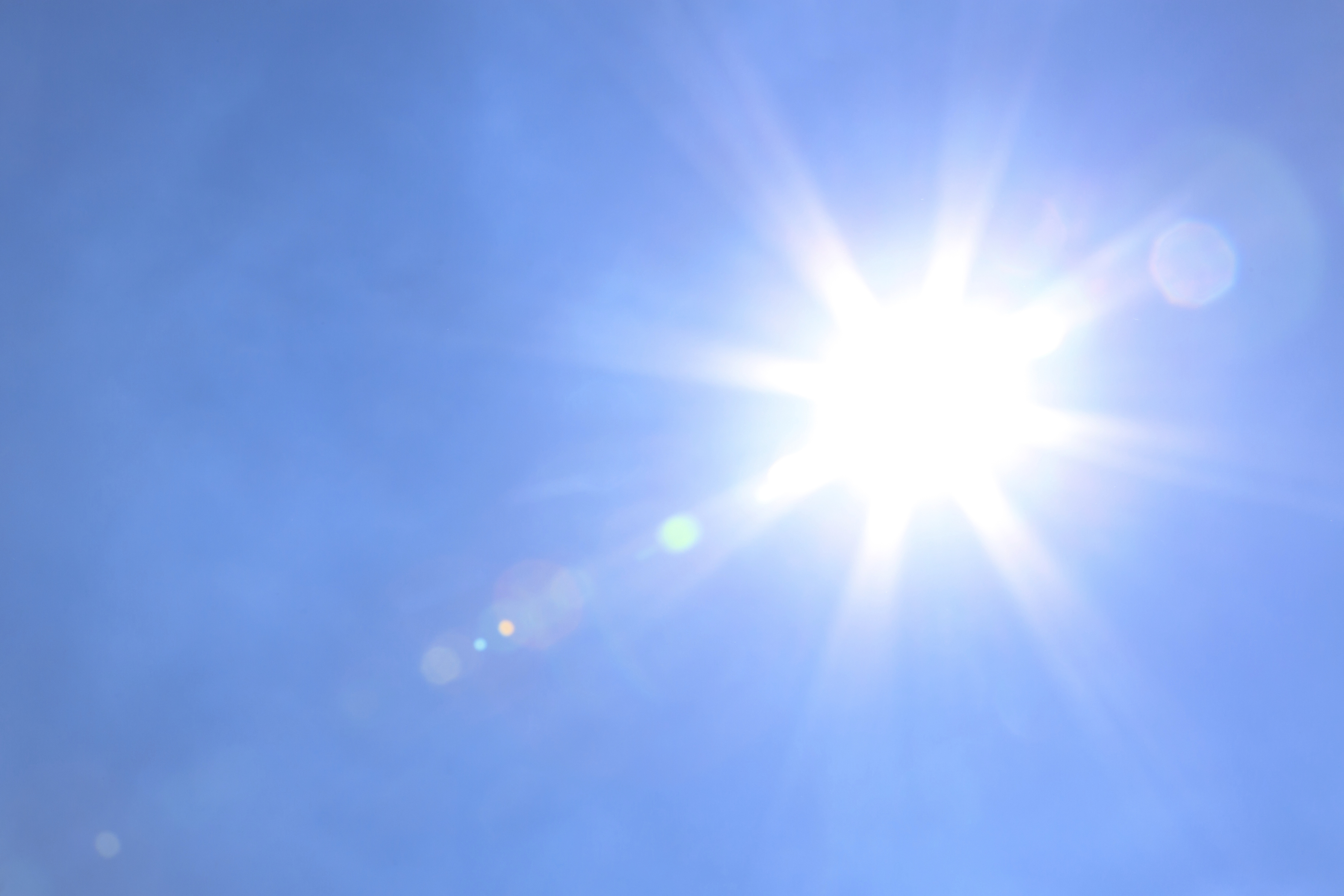
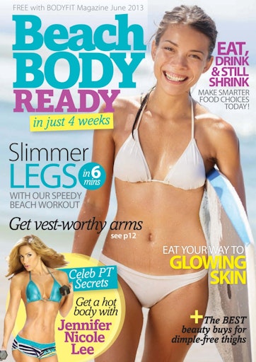
The location of a photoshoot determines the lighting. If the images are taken in a room without windows, natural lighting won't even be an option. The most common use of lighting for fitness magazines are is natural lighting, they mostly use lighting equipment hat prevail different types of artificial lighting. But in contrast, my magazine is going to use mainly natural lighting. However some fitness magazine do use natural lighting but the location is almost never at the gym it's mostly outdoor at like beaches and parks. Here's an example of a magazines using natural lighting.

In both pictures use can clearly see the use of natural lighting. In the first image, the face of the women is shined on by the natural rays of the sun, making her skin glow as its said in the magazine. On the second image the whole frame is filled with natural lighting. This type of lighting attracts reader's as it gives out a beautiful scenery, concluding that it is probably a sunrise or sundown.

Lighting is an extraordinary key factor in creating successful shots. Natural lighting gives out features that no other type of lighting can give out. I'm going to take advantage of natural lighting so my shots are going to be mostly in the daytime where natural lighting comes in my gym. Natural lighting gives out a more vibrant feeling that I personally think will make my magazine more aesthetically pleasing.
https://markbrion.com/the-importance-of-light-in-photography/
Color:
Color is extremely important in every aspect, especially on deciding what color is going to be my magazine. Color influences the audience. A way that makes any magazine page outstanding is the colors that are used. The colors can reflect on the mood of the reader. Color adds meaning to a page instead of having a plain white page.
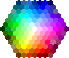
Selecting the wrong color can cause disengagement of reader's. There are three primary colors which are: blue, red, and yellow.
Warm colors: Orange, Red, Yellow. These colors evoke energy and passion.
Neutral Colors: Black, Brown, White. Used very often as background colors. White and Black are one of the most used colors in magazines, they match and go along with any layout or color. And then brown gives out a very funky feeling.
The masthead of my fitness magazine is going to be Red. I'm choosing red because it's a very vibrant color, it could be seen from far away and also catches the attention of the reader from the rest of the colors. Red is also a vey popular color among fitness magazines.
Here is an example of a masthead in Red

According to the institute of Color Research, people make judgement on your content "in 90 seconds or less", and the majority of the judgement is based out of color. My magazine is going to have a more sense of different coloring, due to the background being the gym. I'm going to use white as the color of my content in the front cover and then black inside the content of the magazine, paragraphs, articles etc. I'm going to use many different other bright colors because color is important and using different colors is more amusing than being plain. The audience's eyes are more likely to catch the eye of rainbow colors than just plain dark gloomy colors.

https://www.flip180media.com/tips-for-periodical-publishers/color-theory-designing-your-digital-publication/
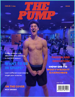
Experimenting Front Cover Layout:
How did you integrate technologies- software, hardware and online- in this project? I've used so many softwares in this project and...